Project Navigation
Introduction My Role The Challenge The Approach The Outcome The Framework Ideation Design Guideline HI-FI Wireframe Final Design Reflections
To comply with my non-disclosure agreement, I have omitted and obfuscated confidential information in this case study. The information in this case study is my own and does not necessarily reflect the views of Backed or Sony Pictures.
This product was created for Sony Pictures Entertainment's risk management department to estimate the risk levels for intended production locations during the Covid-19 pandemic, evaluating and providing advice on the next production shooting scene.
I was the only designer in the team, leading the design process and working closely with the client, the COO, and the engineers. The project took about eight weeks.
I participated in meetings with clients throughout the design process. During the ideation phase, I organized workshops with team members to uncover insights and translate concepts into features that address the client's needs and motivations. Then quickly sketched out possible design solutions for evaluation.
I created the framework and prototypes to share the design principles and content strategy, which helped brainstorm valuable ideas, gain alignment, and drive decision-making.
Collaboration both internally and externally is crucial. I collaborated with the product team and Sony Pictures' Covid-19 risk specialists to run the design process, ensuring product development always meets the customer's needs and business goals.
I executed information architect, journeys, task flows, wireframes, prototypes, and design specs.
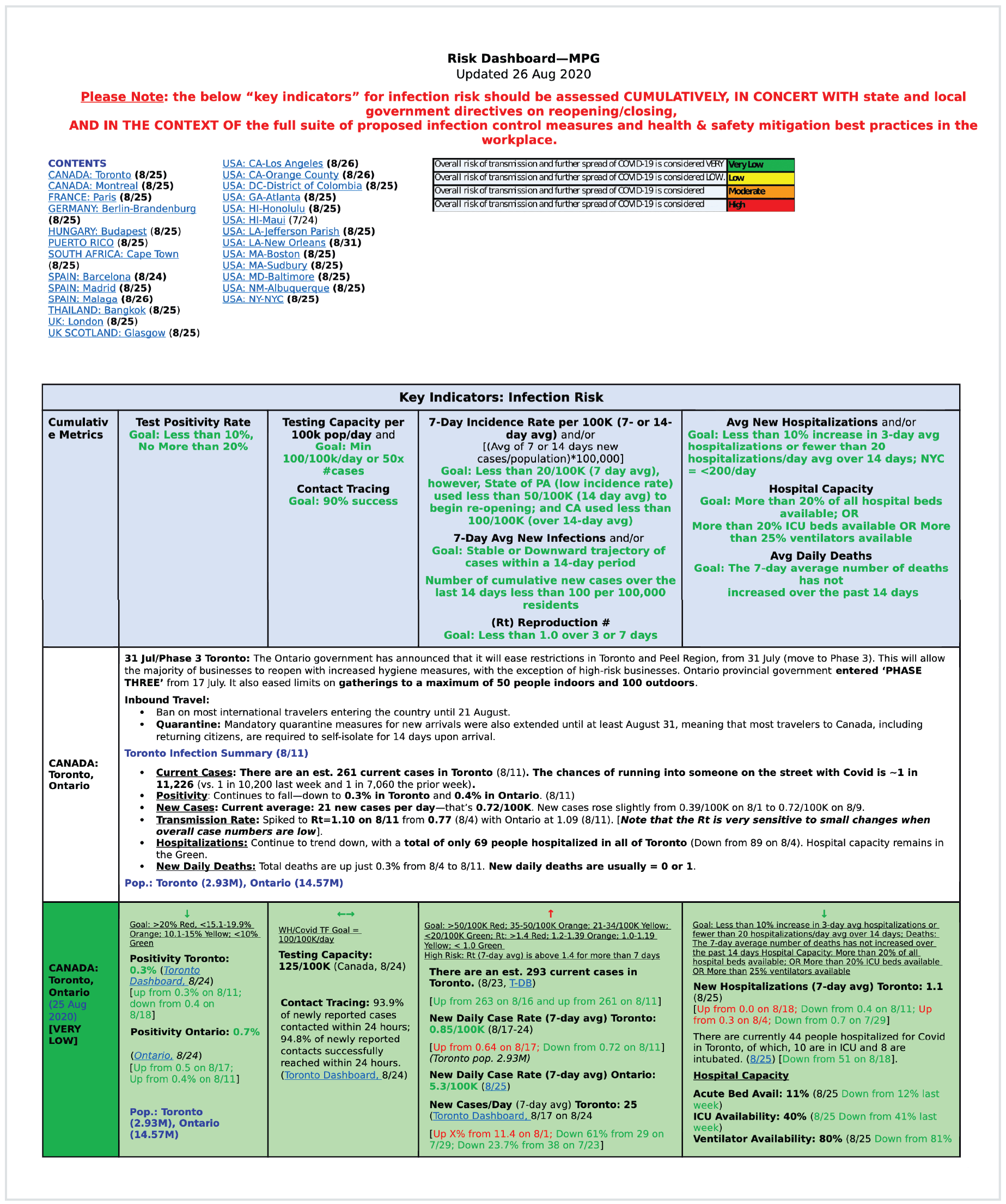
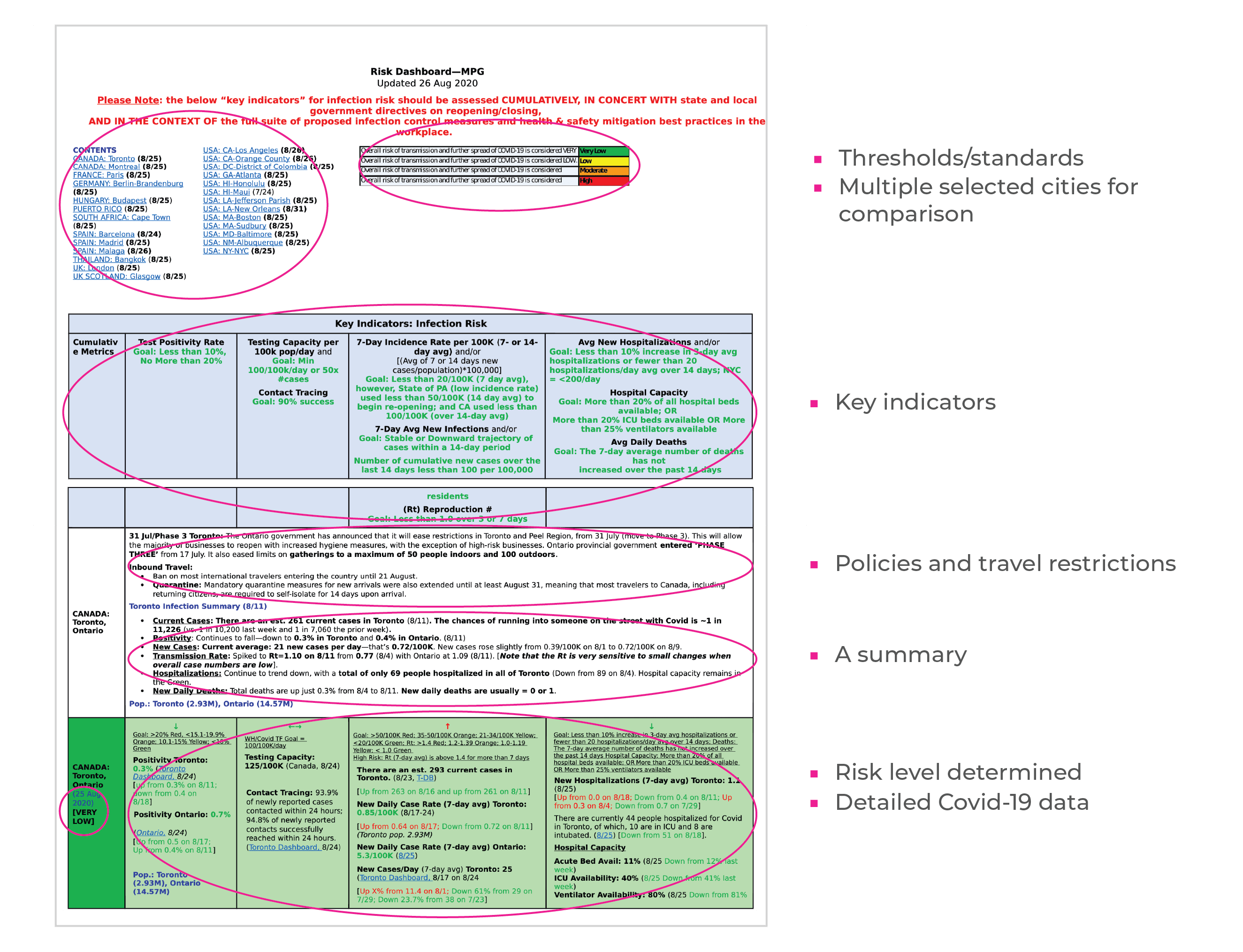
Below is a portion of Excel sheets showing how Sony processed Covid risk information gathered from the internet and evaluated the risk-threatening levels.
Their goal was to ascertain safety in selected production shooting locations. For that, they spent tons of time manually collecting information from multiple resources to process analysis with ambiguous standards.
Sony Pictures risk evaluation specialists want to compare Covid-19 risk of production shooting locations so that they can make reliable decisions on the location-choosing for the next shooting scene in terms of Covid-19 safety.
To pick a location for the next production shooting scene, the Covid-19 risk specialists chose key indicators that contribute to the decisions in different weights. The conclusion was made by comparing the data of these indicators.
The red(high risk), amber(moderate risk), yellow(low risk), and green(very low risk) assignment mostly rely on the risk specialist’s decision because the overall comparison between cities is not easy. Some data of a city can be better than another city while other data is the other way around; Therefore, the conclusion is not always as accurate.
To solve the problem of time-consuming, easy to make mistakes on tedious and repetitive tasks, Sony expects us to automate data collecting, data analysis and finally generate a report showing city recommendations. I focused on understanding Sony’s problem, seeing their current working process as one of the approaches to solving the problem, trying to avoid detaining in a specific problem-solving idea, aiming to design a report generating process succinctly, quickly, and accurately.
Product design and visual design were broken into parallel work streams and I was mainly focused on the product design, especially in the ideation phase, and the design intern initiated the visual design.
In order to keep every step solid, we touched base with Sony to review the design and collect feedback to avoid moving forward to any wrong direction.
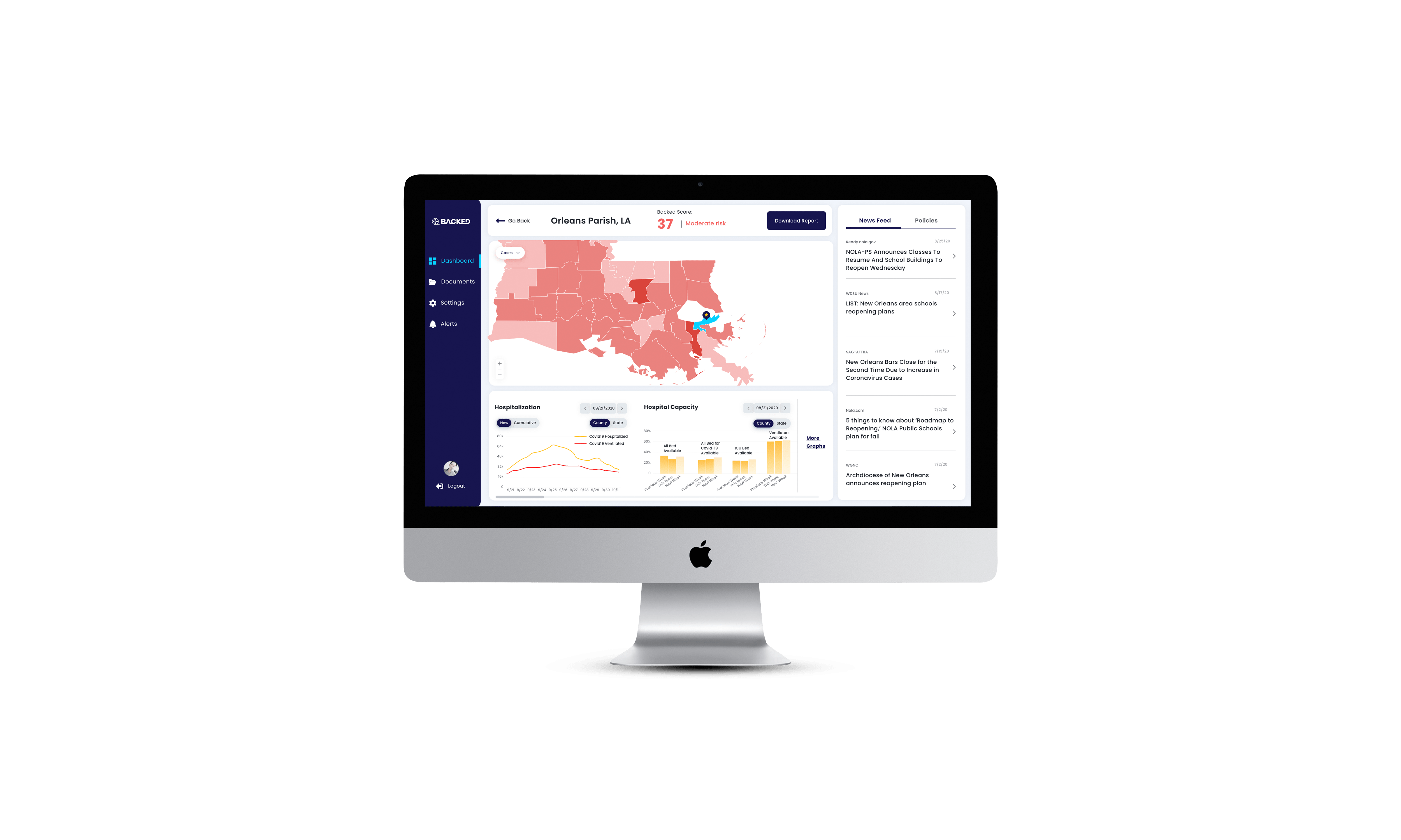
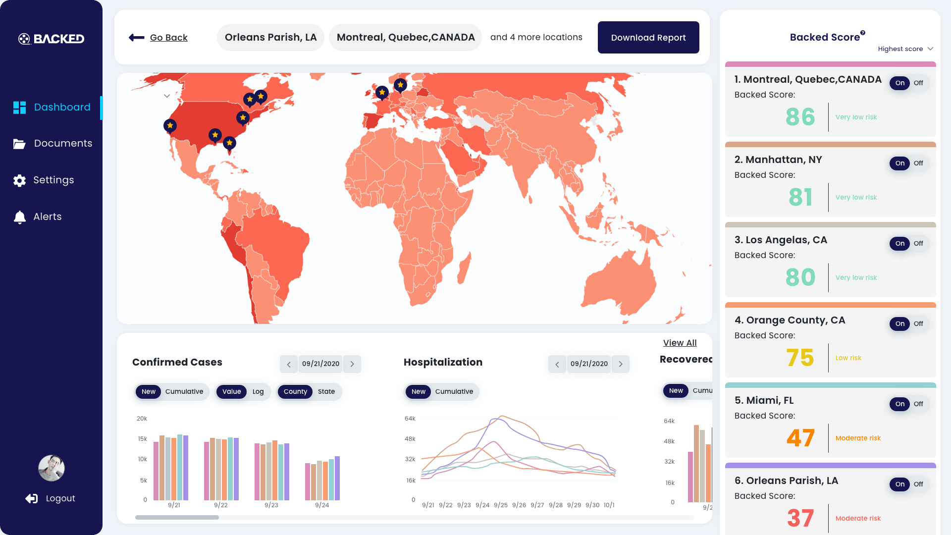
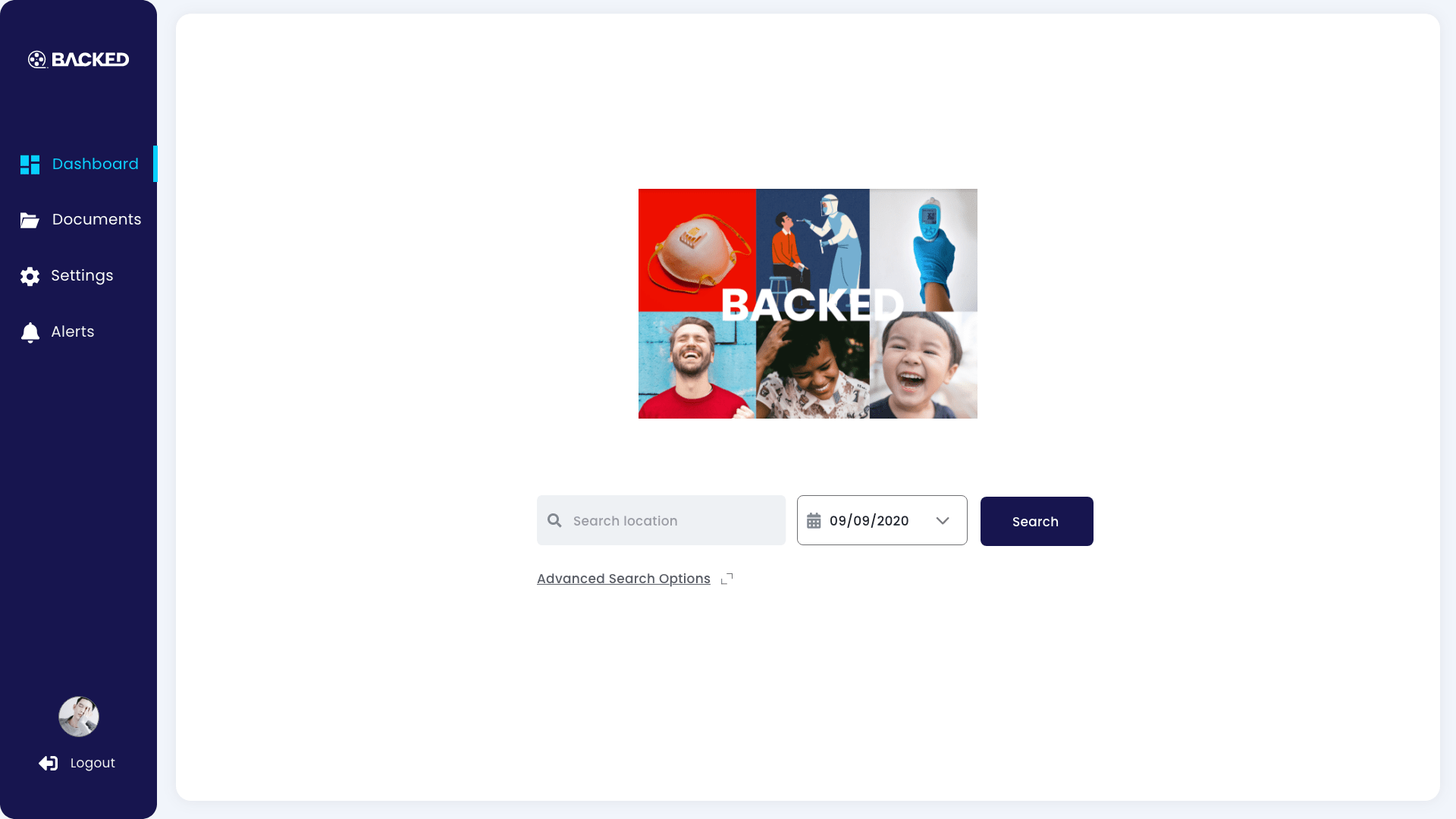
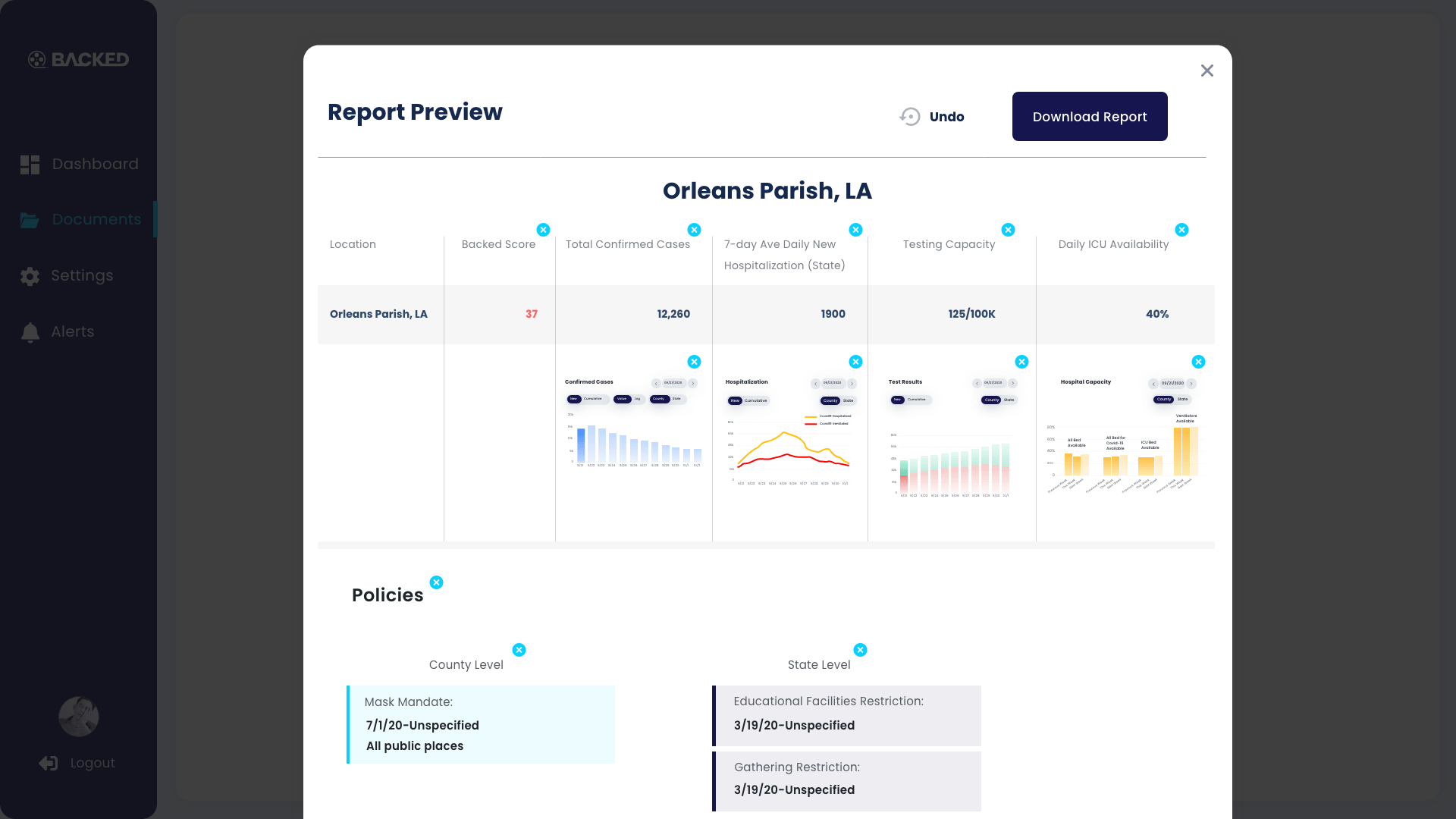
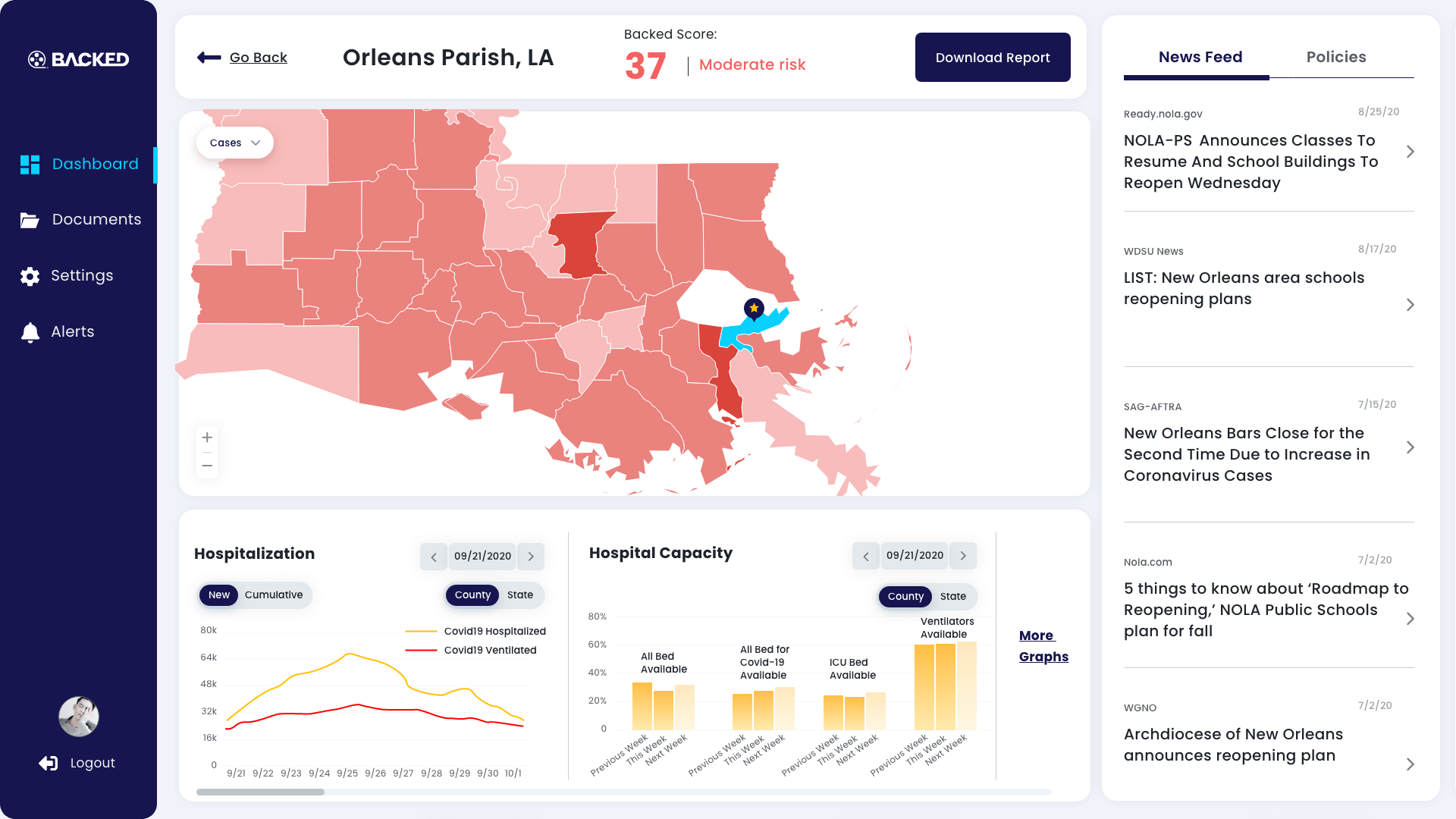
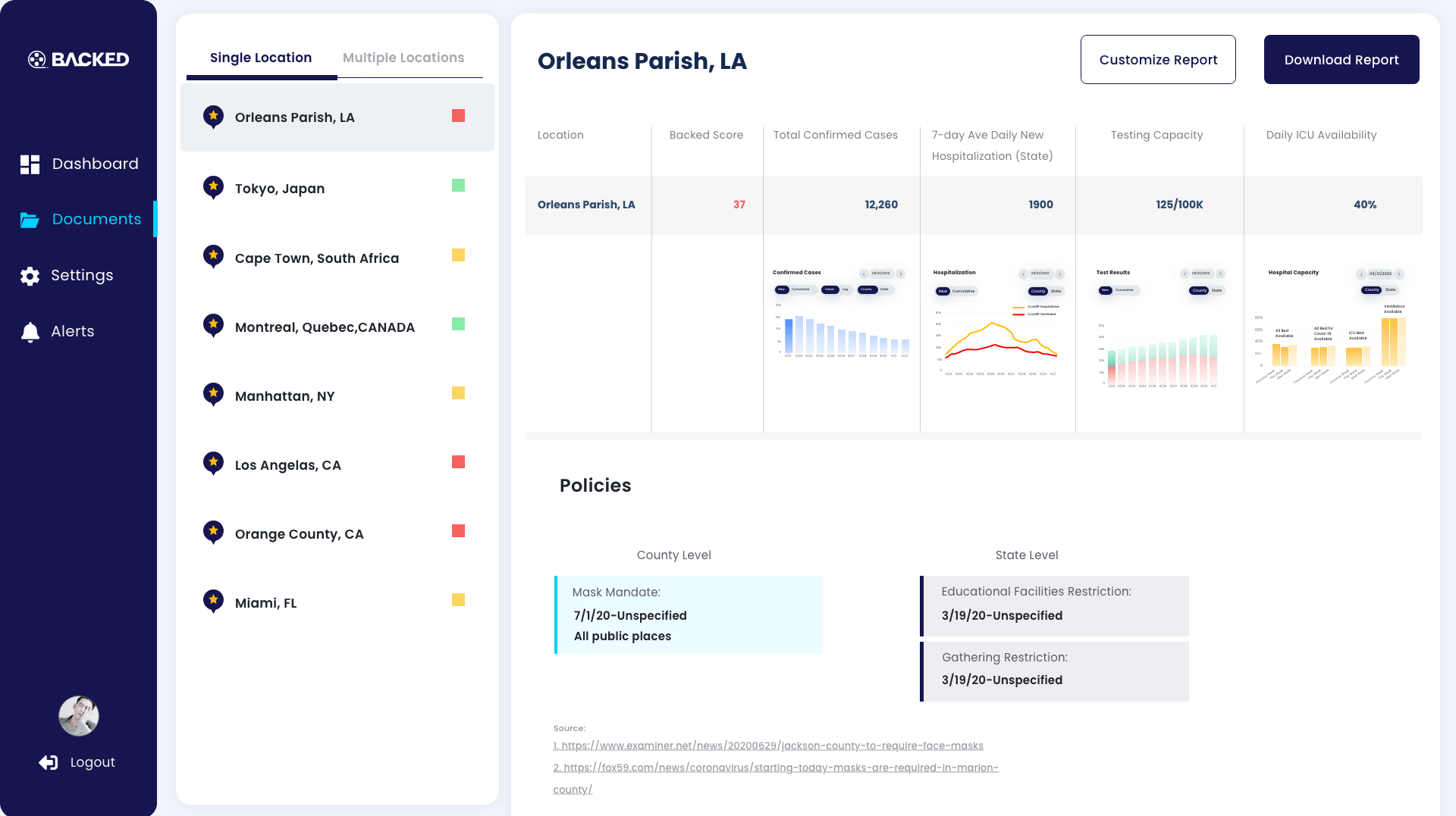
The covid-19 dashboard is a tool for risk evaluation specialists at Sony to generate a Covid-19 risk report of a region and compare multiple regions' risk levels to choose the next shooting scene.
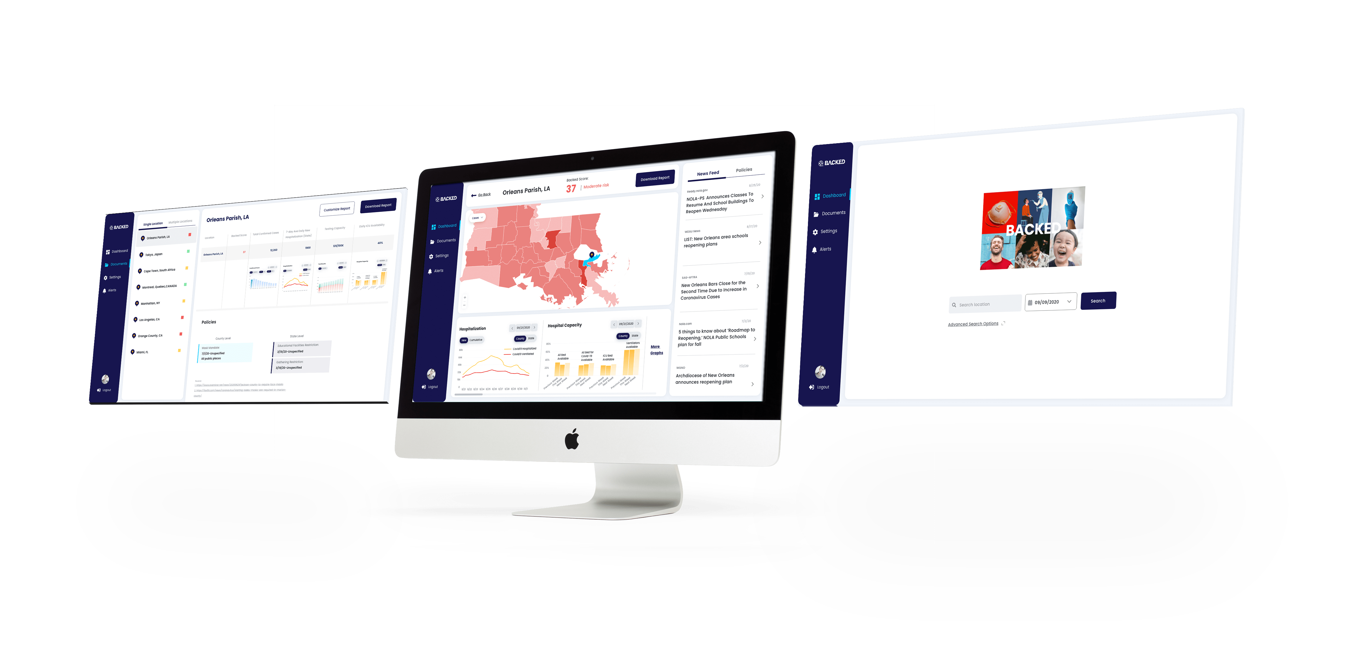
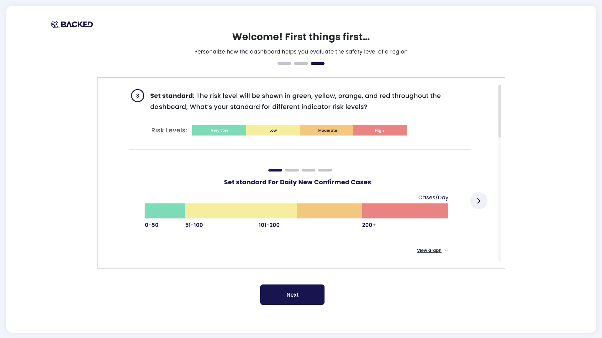
The score quantitatively indicates the covid risk level of a region. It’s calculated according to the given variables and standards, offering the user tiers -red, yellow, green, of risk level and how much one city is safer or riskier than another city, especially when these cities are in the same tier.
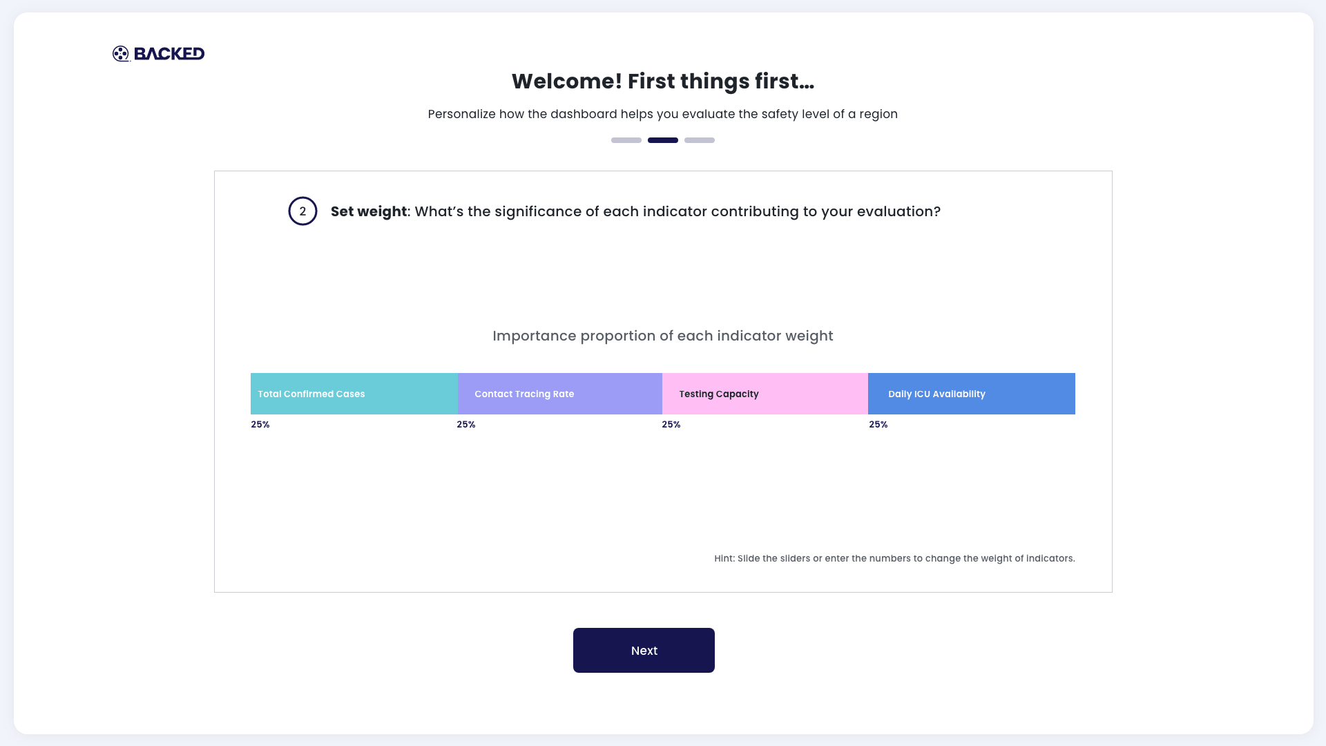
The users have complete control to set variables. They decide which metrics make more sense impacting risk levels, and they set the color threshold for risk levels by their own standards. It will be resulting in color representation and scores vary according to different settings.
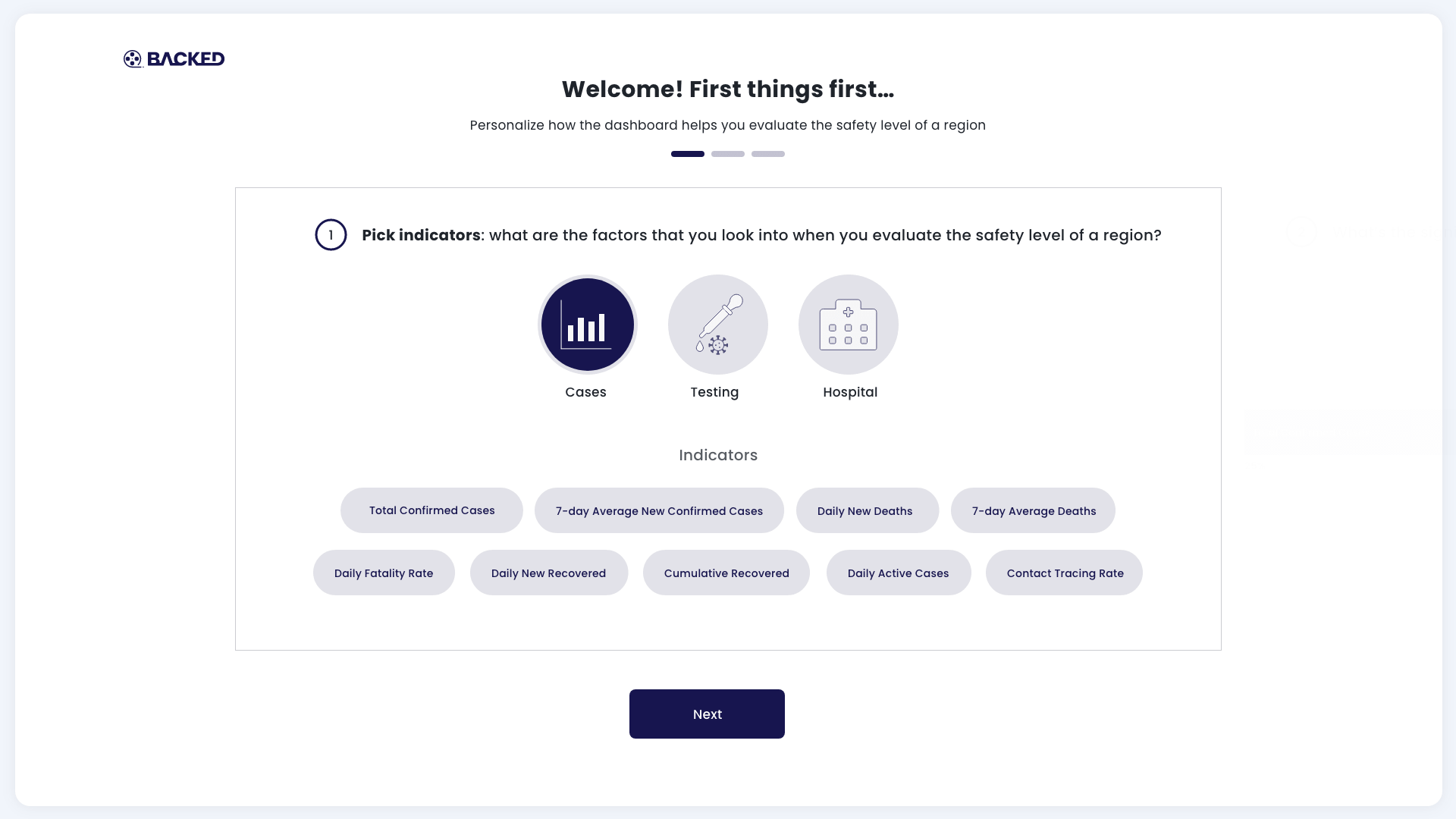
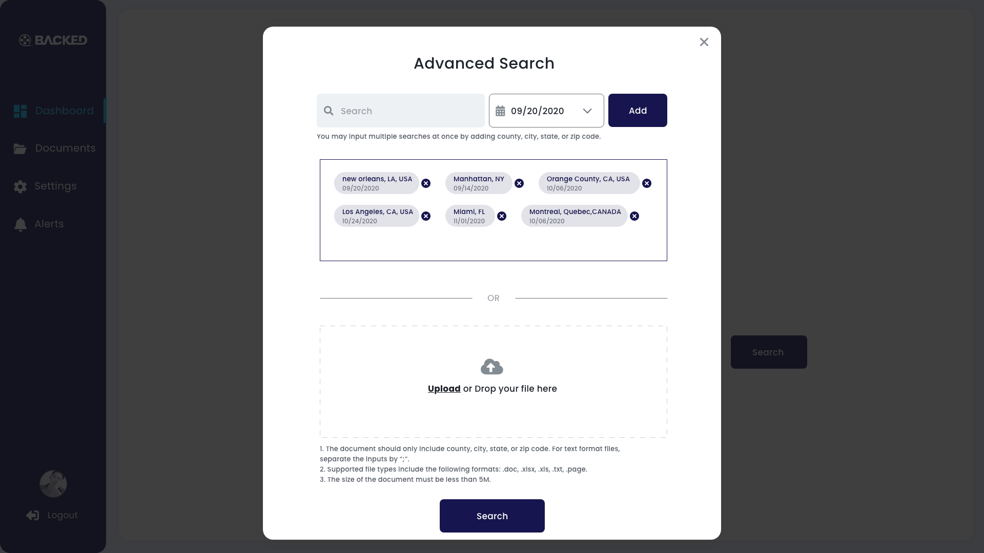
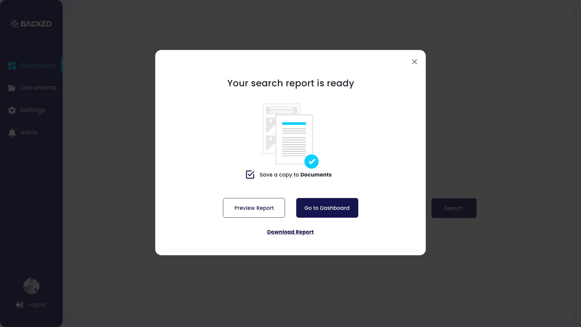
The users not only have the universal control of the variables to view on the dashboard and the content in the report, but also micro adjustment of individual variables, adding or deleting cities in a search result, or include or exclude specific content to export a report.

The biggest challenge I faced throughout this project was understanding the product's requirements for an unfamiliar field and coming up with a systematic solution to their core problem with a strict time limit. I needed to find out their working process, where this product fits in their workstream, and where my constraints are, including the prior knowledge that the users have in terms of covid-19, how detailed information they were looking for to include in the report, the users' visual preference, etc.
I went through the working process of requirements, ideation, consensus, prototype, approval, detailed specs and handoff.
From the scoping meeting with Sony, we learned that they chose the current limited number of metrics to evaluate a city's risk level because of the constraint of workforce and time. If possible, they would love to include more factors that meaningful for evaluating Covid-19 risk.
Sony's approach was to select indicators and set standards for them, evaluate the data and took policies and travel restrictions into account to generate the outcome that summarized the underlying region's risk level and used red/yellow/green colors to visualize it. This is also reflected in their spreadsheet.
At school, we take a few subjects each semester. These subjects' scores contribute to our final score at the end of the semester with different weights. The teacher knows which student did better than another student during this semester under the school's grading standards by comparing the final score.
With the same logic, if we can calculate a score for each location, the user would quickly point out which city is safer and how much safer than another one.
Thus, I quickly sketched out the initial idea of the scoring system.
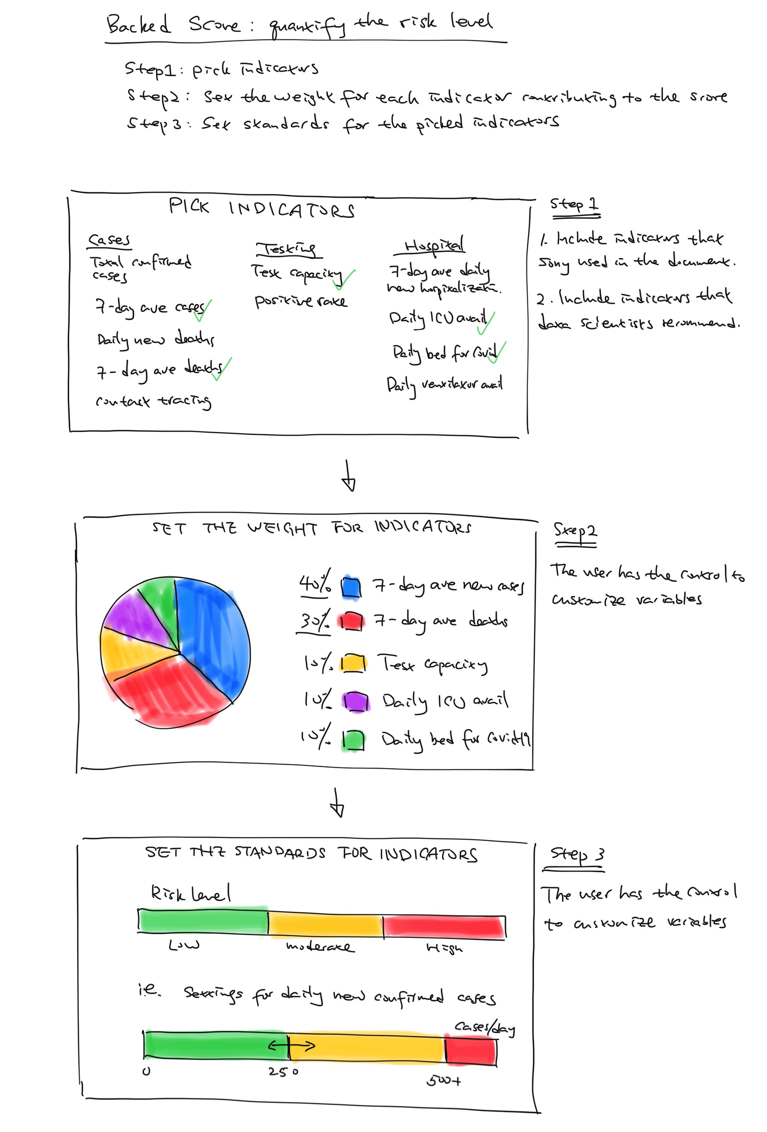
Initial idea of risk scoring system
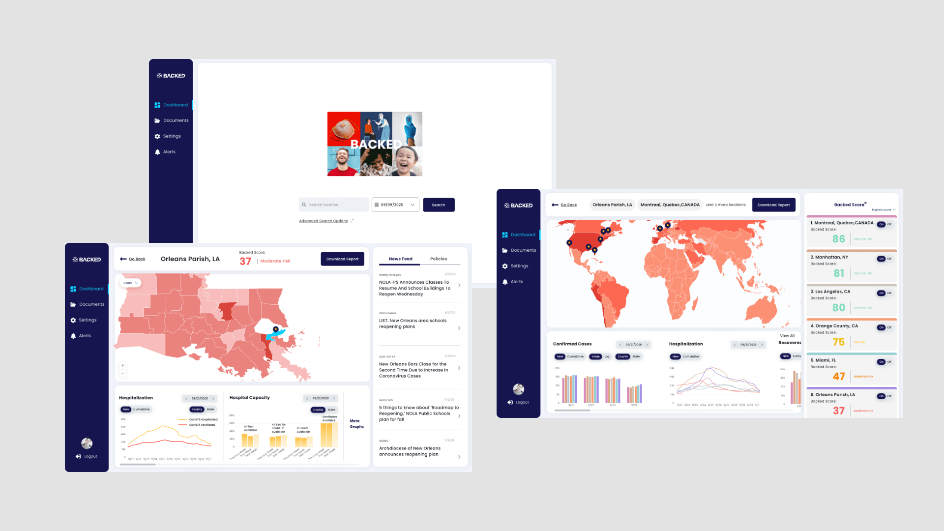
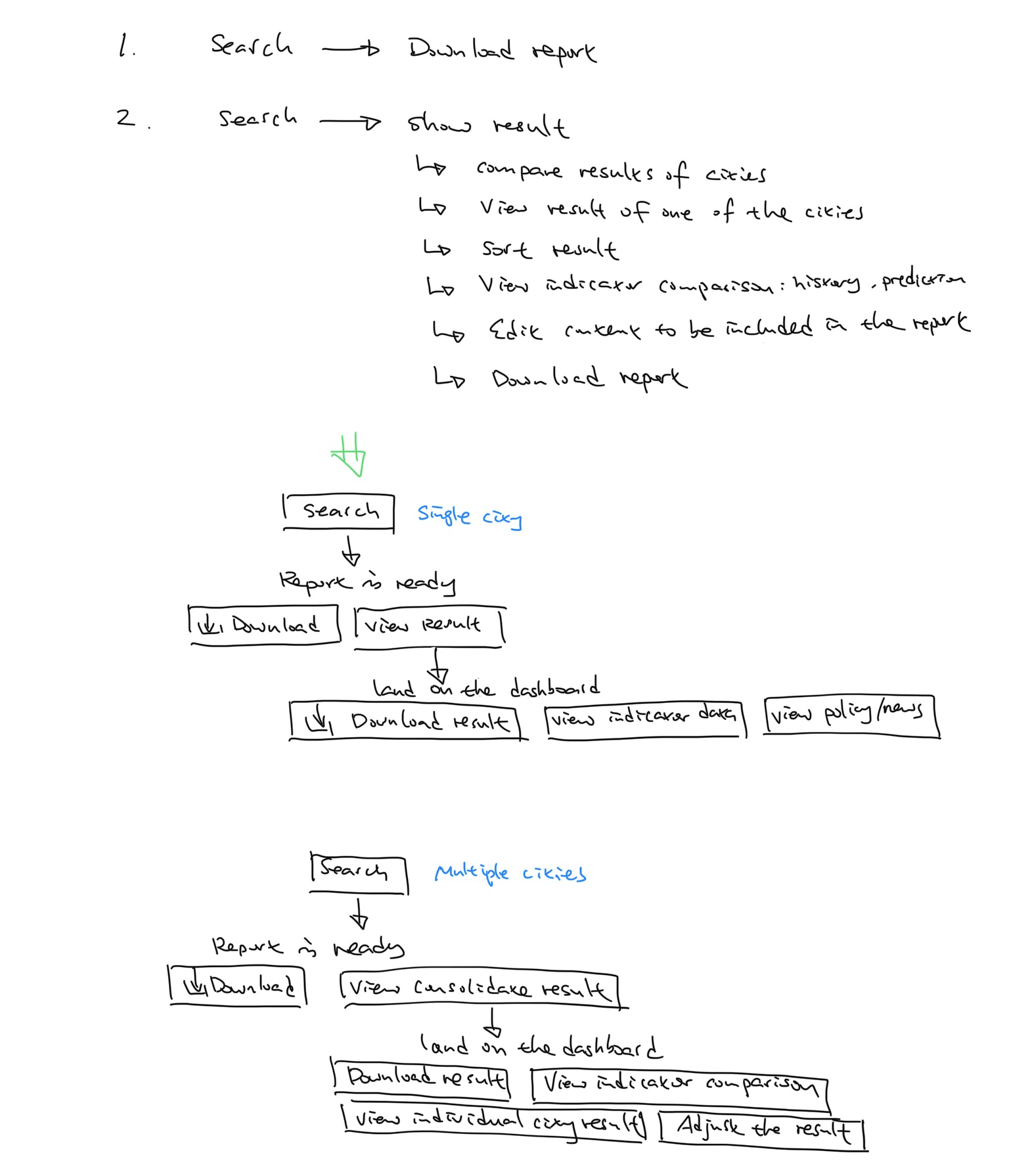
The dashboard was required to accomplish the tasks that Sony had been doing manually, compare data between multiple cities, and view the trend and get near-future predictions for indicators. Thus, the key features and content were ready. My challenge at this point was to organize the content and come up with design solutions.
From the needs of the client, there are two key task flows
1. The list of cities to be searched is ready; the user wants to quickly generate the report of these cities.
2. A list of cities to be searched, the user wants to compare the risk levels of these cities together, get the safest ones, view individual cities, investigate the detailed data comparison of each indicator, and finally generate a report of sorted cities with selected indicators.
To start designing the main pages of the dashboard, I explored possibilities by sketching on paper.
For individual city searching, the dashboard should show the score to digitalized this city’s safety level, the present and the past data of the metrics that matter the decision making, and policy and news information. It also allows the user to drill down to the details as needed.
For multiple city searching, the search result should be represented in a similar pattern delivering information to keep the consistency to save the user’s cognitive load and learning efforts.
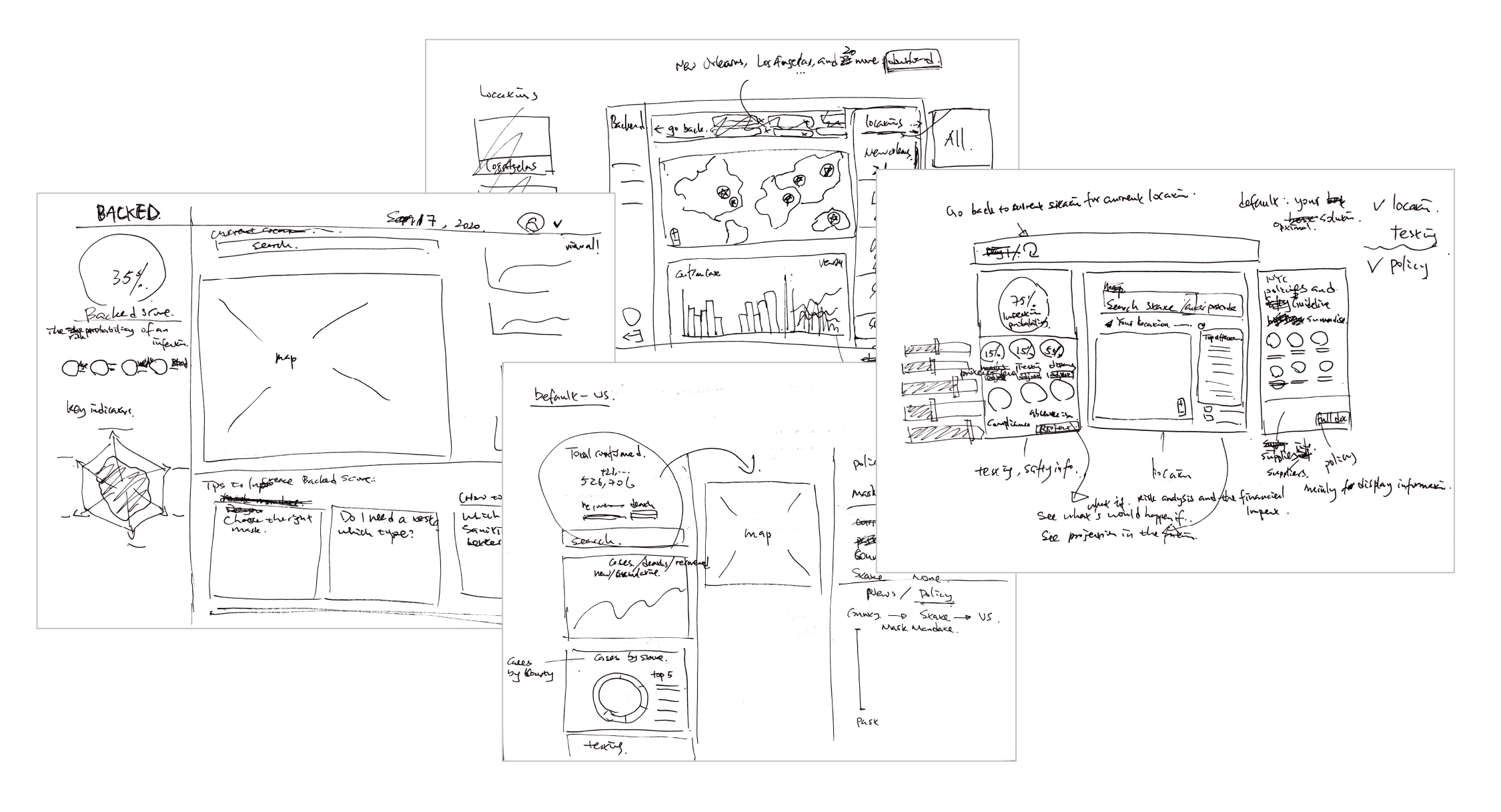
Explorations for the main dashboard screen
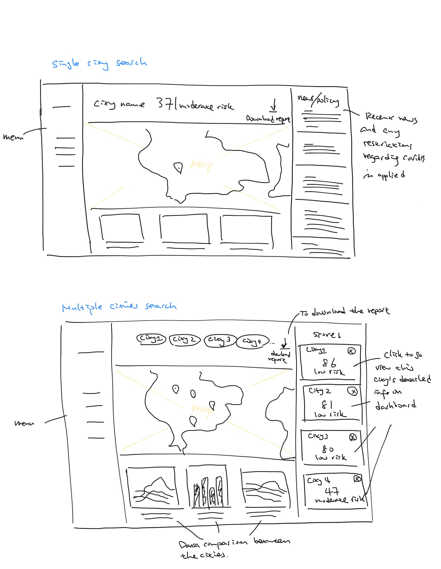
Sketches for the main dashboard screens


When designing this dashboard, I realized this product feels similar to the User Management System that I worked on about two years ago. They both about designing content, allowing the user to have an input, and processing out the output. I reflected that many B2B products have this logic. I learned from this experience always have the starting point to design content together with input and output.
Comparing with my earlier case studies, I made some progress on my writing skills. Throughout writing this case study, I can clarify my thoughts clearer; my ability to articulate problems, solutions, and results has increased. I guess this might be because I made some progress on my problem-solving skills, analytical skills, and storytelling skills. Then, I started thinking: how about the other way around? If I leveled up my writing skills, would that help master my design skills? Thus I decided what to learn next: write.